The project focused on rebranding the Galway Centre for Independent Living (GCIL). This included creating a new name, logo, colour scheme, tagline, and typography for both its content and website. I was responsible for developing the visual elements of the rebranding while my colleagues offered suggestions for a communication strategy. GCIL is a not-for-profit organization that provides affordable services to empower individuals with physical and/or sensory disabilities, helping them live independently and participate actively in society.
The goal was to create a new identity for the organisation, clarify its brand values, inspire a response from the community, and connect with the audience to encourage advocacy for its mission. Objectives were established according to Keller’s Pyramid framework.
logo.
The selected logo clearly represents the word “Will,” which is an acronym for the organization’s new name, “Way of Independent Living Leaders”, and embodies its core values. GCIL wanted to keep the terms “Independent” and “Living” in their branding. Individuals who benefit from their services are referred to as “Leaders”. The logo also features the gorse flower, which is native to the West Atlantic regions, including Ireland. The gorse was chosen for its bright blooms and hardiness, symbolizing GCIL’s commitment to supporting individuals on their journey toward independence.
COLOUR SCHEME.
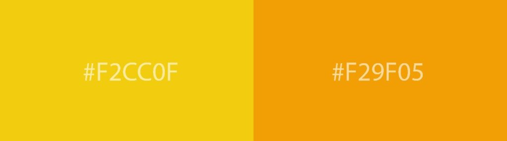
The logo features a yellow colour that stands out and easily captures attention. Yellow is a warm colour associated with optimism, friendliness, and efficiency. This choice is thoughtfully inclusive for people with sensory disabilities. Tritanopia (a form of colour blindness that makes it challenging to see yellow) is one of the rarer types of colour blindness, and elderly individuals generally find yellow easy to recognise.
FONT.
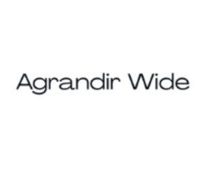
The Agrandir Wide font was selected for its clean and strong lines, aligning with the themes of independence and determination. Its readability across digital and print media further enhances accessibility.
TAG LINE.
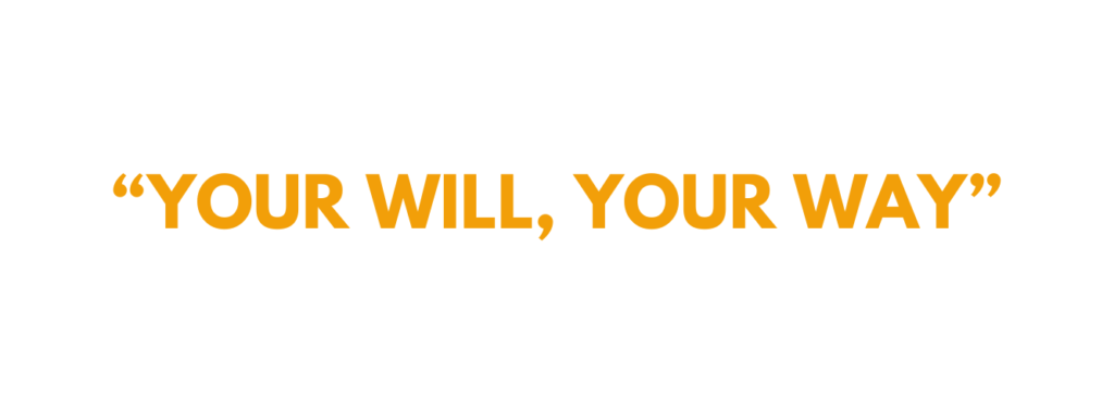
The tagline “Your Will, Your Way” not only recalls the acronym “Will” from the logo but also aligns perfectly with the organisation’s core values.